 Goblin
Settings › Appearance decides how Goblin looks: light or dark, which color theme the window and the menu bar panel wear, how big its text is, and which app icon it uses. Use it to make Goblin easier to read or to match your desktop. The Settings window itself takes the window's color theme, so you see each choice as you make it.
The icon in your menu bar is set in Settings›Menu Bar, not here. See Other panes.
Choose Light or Dark#
- Open Settings›Appearance. (Press ⌘,, then click Appearance.)
- In the Theme card, click Light, Dark or System.
- Goblin changes at once. System follows your Mac's Light or Dark setting and is the default.
The Color and Glass color styles are always dark and Inverted is always light. While one of those is chosen, the card says so (for example "Glass colors are always dark; Light and Dark apply to Standard and Mono") and the Theme tiles have no visible effect. Choose Standard or Mono below to use them again.
Change the color theme#
New in 1.1: The Colors card, including a separate theme for the menu bar panel.
- Open Settings›Appearance and find the Colors card.
- Click a style tile: Standard, Mono, Inverted, Color or Glass. Each tile shows a small preview.
- For Inverted, Color or Glass, a row of color dots appears. Click one: Purple, Blue, Teal, Green, Orange, Rose or Graphite. (Standard and Mono have no color to pick.)
The main window, Settings and the menu bar panel all change. Standard is the default.
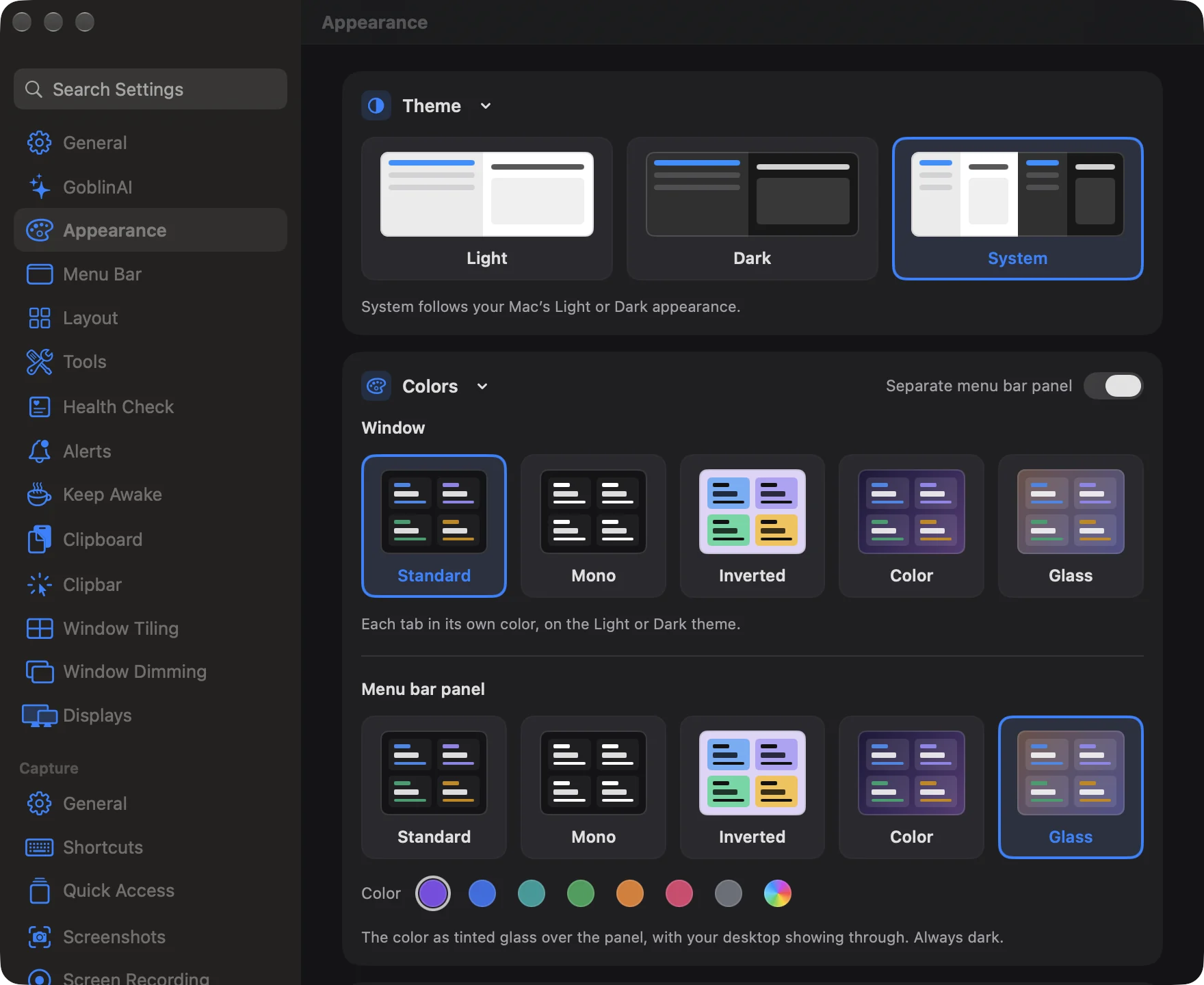
The styles:
- Standard: each tab in its own color, on the Light or Dark theme.
- Mono: no color. Black on white, or white on black with the Dark theme. Warnings stay red.
- Inverted: cards take each tab's color and everything on them turns black. Always light.
- Color: a deep color behind the window and the panel. Always dark.
- Glass: the color as tinted glass over the window and the panel, with your desktop showing through. Always dark.
Give the menu bar panel its own colors#
- In the Colors card, turn on Separate menu bar panel (top right of the card).
- The card now shows two pickers, headed Window and Menu bar panel.
- Choose a style and color in each one.
The panel's own theme starts as Glass with Purple. Turn the switch off to use one theme for both again.
Pick a custom color#
- In the color row, click the rainbow dot, Custom….
- The macOS color panel opens. Choose a color in it.
- The window updates as you drag, so you can watch the color change before you settle on one.
| Setting | What it does | Default |
|---|---|---|
| Theme | Light, Dark or System. Goblin's own light or dark appearance. | System |
| Style | Repaints the main window, Settings and the menu bar panel. | Standard |
| Color | The tint for Inverted, Color and Glass. Not shown for Standard and Mono. | Purple |
| Separate menu bar panel | Gives the menu bar panel its own style and color. | Off |
Make the text bigger#
- Open Settings›Appearance and find the Text Size card.
- Click Standard, Larger or Largest. Each tile shows an "Aa" at that size.
Text Size scales all of Goblin's text and layout, including the labels in Storage Explorer. Larger is 15% bigger than Standard, Largest 30%. Standard is the default.
Change the app icon#
- Open Settings›Appearance and scroll to the App Icon card.
- Click Mechanic, Fresh Mint, Night Shift or Classic.
- The Dock and the app switcher change straight away. Mechanic is the default.
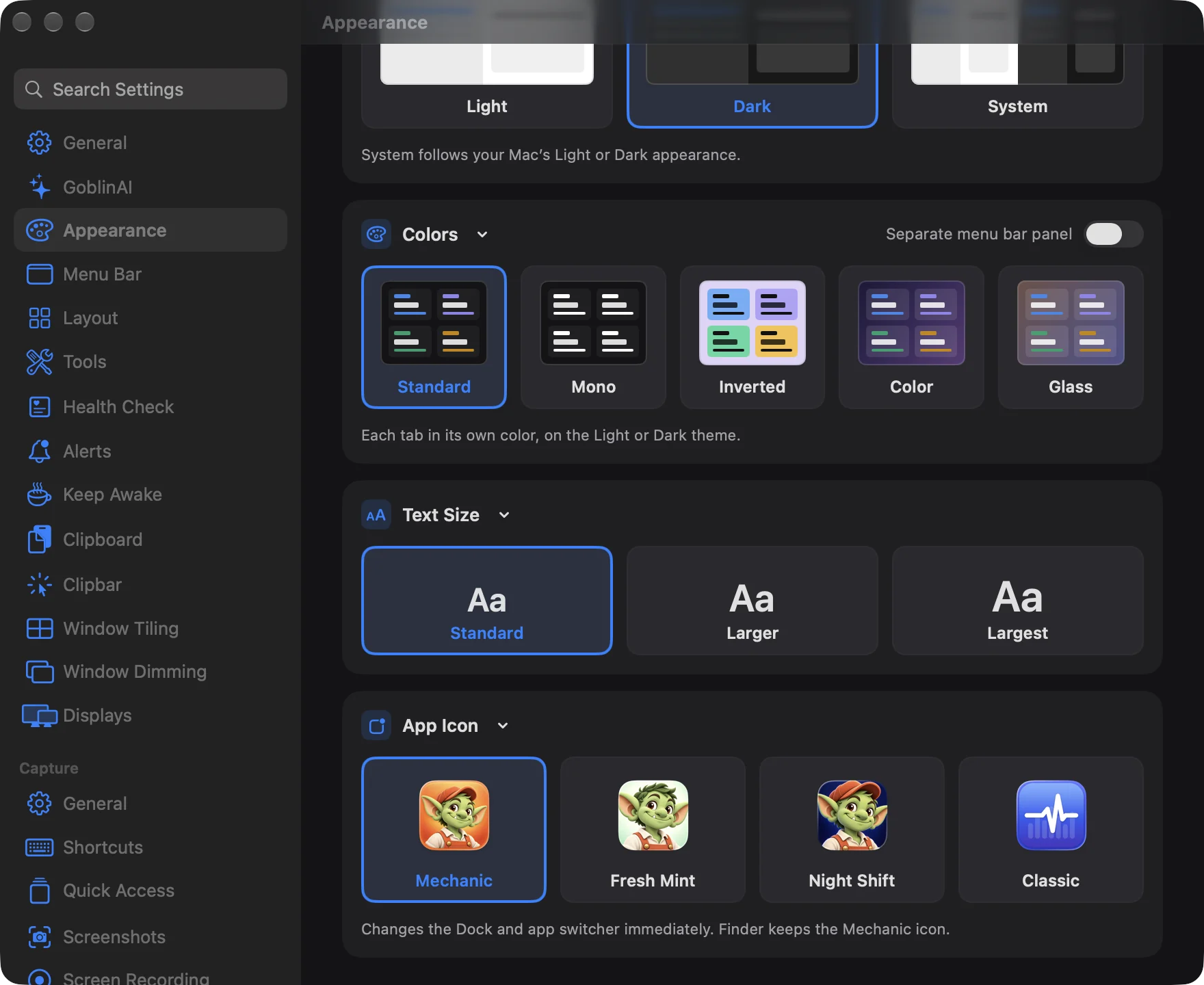
Finder keeps showing the Mechanic icon, because Goblin doesn't modify its own app. With Show in Dock off in General, Goblin isn't in the Dock or the app switcher, so you mostly see your choice in alerts, notifications and the version card in General.
Goblin#
The Animated Goblin switch, Name and Clothes and color controls are in Settings › GoblinAI. See Meet the Goblin.